In the end a simple black and white colour-way worked best with the heavy and dark story theme.

In the end a simple black and white colour-way worked best with the heavy and dark story theme.
Considering the product design, candy colours made a lot of sense.

Creative director burst out laughing… Yea, laugh it up fuzzball! You know this is right.
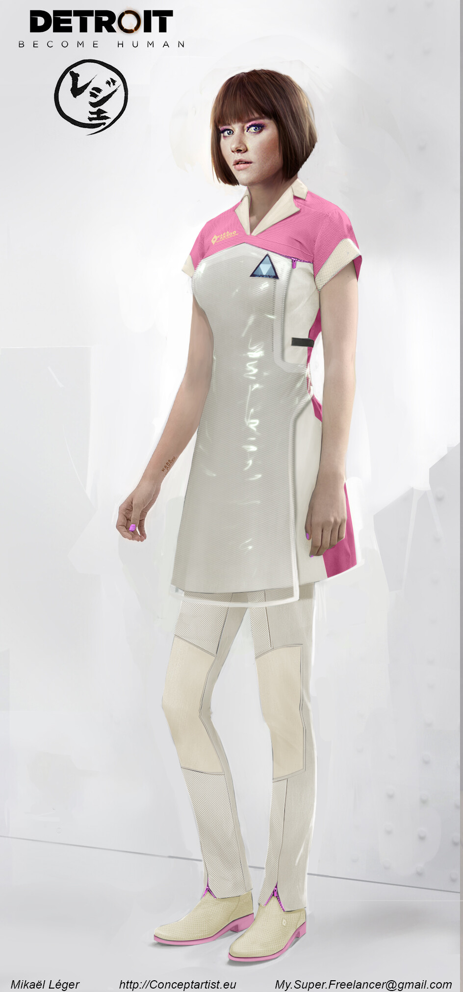
And I thought the apron could be an interactive touchscreen… Yea ,very naive I was.

It was going to be really hard to stray away from the original tech demo design.

And just like that the Android anatomy went back on the menu.


